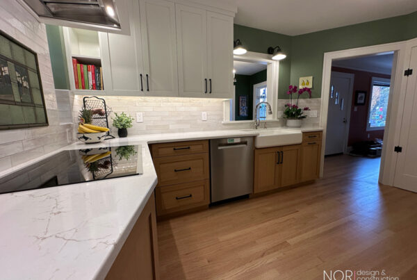
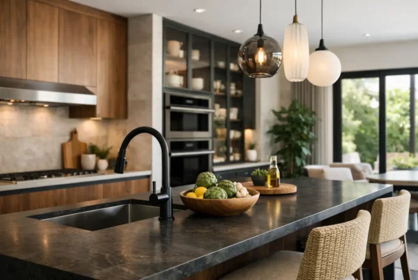
Four whites brushed onto a north-facing living room wall in July look like four versions of the same thing at nine in the morning. Come back to that wall at three in the afternoon in January and one of them has gone faintly lilac, one has gone green, one looks like dirty paper, and only one still reads as white. Nothing about the paint changed. The light did.
That gap — between how a color behaves in a showroom and how it behaves in a Seattle room in the dark half of the year — is where most palette decisions go wrong. It is also entirely avoidable, and it is one of the first things we work on in design.
Why does the white I chose look gray in my house?
Because a paint chip in a store is being lit by bright, high-output, usually cool artificial light, from directly above, with no other surfaces reflecting into it. Your living room is being lit by a low, diffuse, cool sky through a window on one wall, with a fir floor bouncing warm amber up from below and a wall of cedar outside sending green in sideways. Those are not slightly different conditions. They are different problems.
Whites are the hardest colors to get right here for exactly this reason: they have almost no pigment to hold their own, so they take on whatever is around them. A white with a cool undertone, which looks crisp under showroom light, tends to collapse into gray on a north wall in December. A white with warmth in it stays white longer, and often reads cleaner in our climate than the color that was technically “brighter” on the chip.
What does Seattle light actually do to color?
Three things, consistently.
It is cool and diffuse for months at a time. Overcast sky is soft and directionless, which is genuinely flattering — it is why photographers like it — but it is also cooler in cast than direct sun. Cool light mutes warm colors and amplifies cool ones. A terracotta that felt earthy in a sample photo can look dusty and flat under it; a blue-green you thought was subtle can take over a room.
It arrives green. This one catches people. Mature firs and cedars stand close to the house on a huge number of lots here — in Seaview, in Genesee, along the ravines in Delridge — and the light coming through a window screened by evergreens carries a green cast into the room all day. On a lot like that, a warm neutral with any yellow in it can turn olive without anyone understanding why.
It runs out early. In December, useful daylight is a short window in the middle of the day. For most of the hours you are actually home and awake, the room is lit entirely by what you installed. Which leads directly to the next question.
Should paint be chosen before or after the lighting plan?
After — and this is the sequencing decision that separates a palette that works from one that has to be repainted. The light sources in a room are a bigger variable than the paint on the wall, because for a large share of the year they are the light.
So we specify the lamps as part of the palette, not as an electrical afterthought. Two things get decided: color temperature, and how faithfully the source renders color. Warm sources in the 2700K–3000K range are where most of our residential work lives, and consistency matters more than the exact number — a room with three different color temperatures in it will never look settled, and no paint color can fix that. Then color rendering: a low-quality source strips the life out of wood tones and stone in particular, which is a costly thing to discover after the countertop is installed.
We go much deeper on how the layers get built in our piece on layering light through a whole-home remodel. For palette purposes, the short version is: decide the light, then choose the color under it.
Do dark colors work in a place this dark?
Often better than pale ones, and we say this against the reflex most homeowners arrive with. The instinct in a dim room is to go as light as possible, but a pale color in low light does not read as bright — it reads as gray and slightly sad, because it is showing you exactly how little light is available.
A deep, saturated color in the same room does something else. It stops trying to be luminous, holds its own character in low light, and makes the lamps you do have read as warm pools rather than as insufficient. Studies, dining rooms, powder rooms and the upstairs rooms tucked under a bungalow roofline are all candidates. The rule we apply is that the dark room needs to be a room you occupy in the evening; a dark home office you sit in at eight in the morning in February is a different and harder proposition.
Light-filled rooms are the ones that can carry pale, quiet, complex neutrals — the south and west exposures, the rooms with a water or territorial view where the glass is doing the work. Matching color intensity to available light, room by room, is a more useful organizing principle than picking a single whole-house color.
How do I test a color properly?
Not with a chip, and not with a two-inch swatch brushed straight onto an existing wall — the old color underneath will distort it. What we do, and what we would tell any homeowner to do:
- Paint large boards, primed, two coats, at least a couple of feet square. Small samples read darker and more saturated than the finished wall will.
- Move the board around the room and stand it against the floor, the cabinets and the stone, not just the wall. Colors are decided by what they sit next to.
- Look at it at three times: mid-morning, late afternoon, and at night with the lamps on that will actually be in the room.
- Look at it on a gray day on purpose. A color that survives an overcast Tuesday in November will be fine in August.
- Never decide from a phone photo. Phone cameras correct white balance automatically, which is precisely the variable you are trying to observe.
How does a palette hold together across a whole house?
By keeping a small number of things constant and letting the rest vary. In our interior design work we typically fix the trim and ceiling color across the entire house, hold one consistent metal finish and one consistent light temperature, and then let wall colors change room by room within a family that shares undertones. The house reads as one idea, and no single room has to compromise for the others.
Existing materials get a vote too, and in older houses they get a loud one. Original fir floors are not neutral; they push amber into everything above them. Existing stone, brick around a fireplace, and any woodwork you are keeping all set boundaries the palette has to live inside. You can see how those relationships play out across finished rooms in our project gallery.
Color is one of the few remodel decisions that is cheap to change and expensive to get wrong, because it touches every other selection around it. When we work through it at NOR Design & Construction, the palette gets resolved with the lighting, the cabinetry and the stone in the room together, before any of it is priced.
If you have been staring at sample boards for a month and getting further from an answer, bring them to us. We will look at your rooms, your exposures and what is growing outside your windows, and build the palette from the light you actually have. Book a design consultation, or call 206.979.3420 and we will find a time.