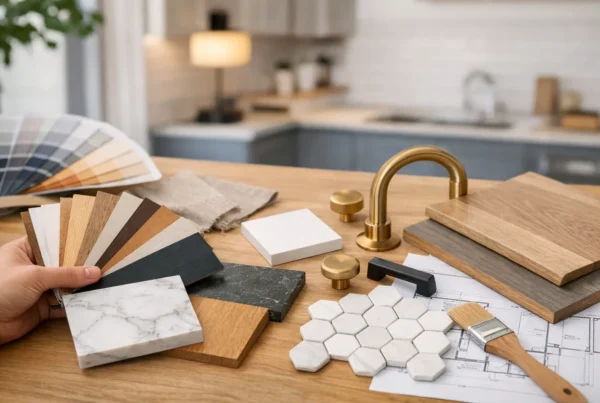
The backsplash is usually the last material chosen in a kitchen and the first thing anyone notices walking in. It is also the decision most likely to be made in a single afternoon, off a display board, under showroom lighting that looks nothing like the light in your house. Ten years later, that afternoon is what people are describing when they say a kitchen looks dated.
We treat a backsplash the way we treat a floor: a large continuous surface you cannot change later without disturbing everything around it. Three things decide whether it still reads well in a decade — the scale of the tile against the wall it actually sits on, the grout, and where the tile stops. Pattern and color matter, but far less than any of those three.
Why do backsplashes start looking dated so fast?
Most of the time it is not the material that aged badly. It is the proportion. A tile chosen from a 12-inch sample board has no relationship to the run of wall it will cover, and the mismatch only becomes visible once the whole field is up.
The materials that genuinely date themselves are the ones that were novel first and useful second — mirrored glass, tumbled stone medallions behind the range, mosaic sheets with a strong repeating motif. They read as a moment. Handmade ceramic, honed stone, a simple glazed field tile and a full slab all read as a material instead, which is a much slower way to age.
The other thing that dates a kitchen is a backsplash that was chosen in isolation. If the tile was picked after the cabinets and countertop were already locked, it is usually working to make peace between two decisions it had no part in. We select the backsplash inside the same conversation as cabinetry, counters and hardware, because it is the surface those things get judged against.
What size tile actually works on my wall?
Ask how much wall you really have. In the 1920s bungalows and Craftsman houses we work in across Gatewood, Genesee and Ballard, the field between countertop and upper cabinets is often short — and a window over the sink chops what is left into two narrow columns. Drop a large-format tile into that and you get partial tiles everywhere, cuts that land in the middle of the sightline, and grout joints that fall in arbitrary places.
Smaller tile on a small field gives you a texture instead of a puzzle. On a long uninterrupted run, or on a full-height hood wall with real vertical space, larger tile or a slab has room to be read as one plane, which is when it looks calm rather than busy.
Two details we check before anyone falls in love with a sample: where the cut tiles will land at each end of the run, and how the tile meets the window casing. A backsplash that has been laid out so the cuts land symmetrically at the outside edges looks deliberate even in a modest kitchen. One that starts at a corner and simply runs out of room looks like it was installed rather than designed.
Does grout color really matter that much?
Grout is the pattern. It is the one variable that changes the entire character of a backsplash without changing a single tile.
Match the grout closely to the tile and the field reads as one quiet surface — the tile becomes a texture, and the eye moves past it to the cabinetry and the counter. Contrast the grout and every joint becomes a line, and you have chosen a graphic wall. Both are legitimate. What causes regret is choosing one and expecting the other, which happens constantly when the decision gets made from a sample board where the grout line is one inch long.
There is a maintenance argument here too, and it is a real one in this climate. Kitchens in Seattle spend a lot of the year with the windows shut, and behind a range you are dealing with grease and steam rather than water. Cement grout in a light color behind a cooktop will shade unevenly over time. We generally specify epoxy or a high-performance grout in the cooking zone for that reason, and we talk through the color under the light in your own kitchen before it is ordered — not in our studio, and not in a showroom.
Where should the tile stop?
This is the detail that separates a considered kitchen remodel from a competent one, and almost nobody asks about it until we bring it up.
A backsplash has to end somewhere, and the good endings are architectural: at the underside of the upper cabinets, at an outside corner, at a window casing, at the ceiling on a hood wall. The endings that look unresolved are the ones that stop in the middle of open wall, or die into a cabinet edge at a height nothing else agrees with.
- Behind the range, running the tile full height to the hood or the ceiling gives the cooking wall a center of gravity, and it is the one place we will happily spend more per square foot.
- At an open end of the run, the tile should stop at an outside corner or return onto the adjacent surface — not simply halt where the counter does.
- Around a window, deciding whether to tile into the reveal or hold back at the casing is a decision, not a default. In older Seattle houses with original fir casings, we usually hold back and let the wood be the frame.
- The four-inch countertop splash that came with so many older kitchens here is not a design choice, it is a leftover. If it is staying, it should be because you want a very quiet wall — not because no one addressed it.
Should the backsplash match the countertop?
They do not need to match. They do need to agree.
Running the counter material up the wall as a full slab is the most restrained version of this, and it works beautifully where the stone has movement worth seeing. But it also means the wall and the counter become one gesture, which leaves the cabinetry to carry all the contrast. That is a design decision with consequences several steps down the line, which is why we make it during design rather than during installation.
The version we see fail is a busy stone paired with a busy tile. Two surfaces competing at the same volume, in a room where light is already doing a lot of work. Give one of them the job.
How does this decision actually get made with us?
Backsplash is part of our material selection process, which runs while the kitchen is being designed and finishes before anything is priced. You see full-size samples in your own kitchen, against your actual cabinet and counter selections, at the hour of day you are usually standing there. Because our background is in interior design, we are looking at how the tile behaves in December light, not just how it photographs.
The practical result matters as much as the aesthetic one: the tile is specified — brand, size, finish, grout, layout — before we write your bid. There is no tile allowance sitting in the contract waiting to be trued up once you make the real selection. The number you sign is the number for the backsplash you actually chose. That is how we price every project at NOR Design & Construction.
If you are staring at four samples on your counter and getting further from a decision, bring them to us. We will look at your kitchen, your light and the wall you actually have, design the backsplash as part of the whole room, and give you a fixed price before construction begins. Book a design consultation, or call us at 206.979.3420.